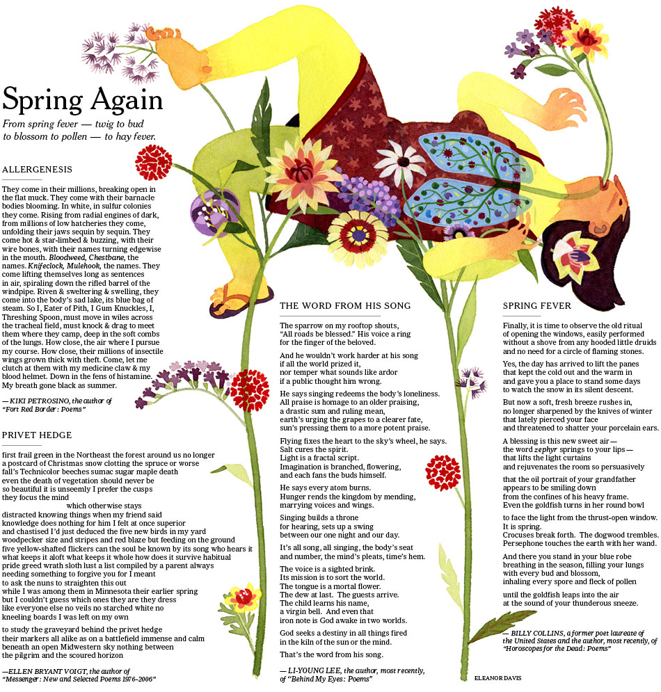
First Aviva sent me the poems along with sample layouts of how they could be arranged, and I did some sketching and thumbnails.
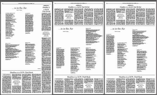
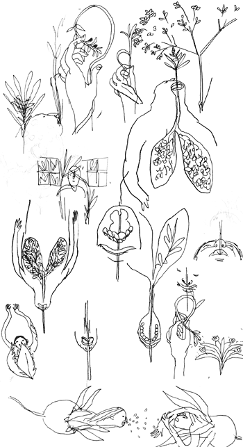
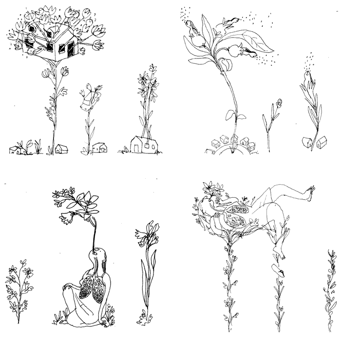
We both liked the 4th one best. Aviva flipped it and sent me the finalized layout.
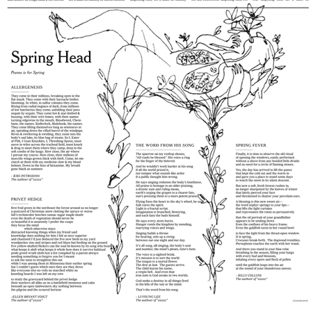
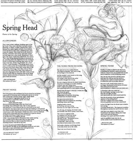
I tightened the pencils, trying to incorporate the drawing and the poems without it looking contrived.
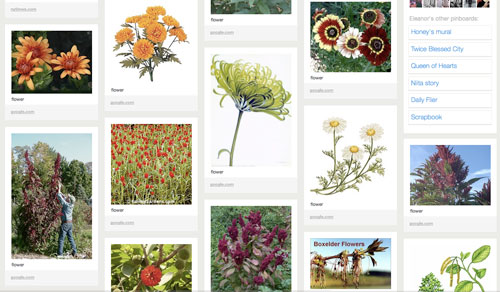
I collected a lot of reference photos of allergy-causing flowers, and pollen, and lungs, on Pinterest,
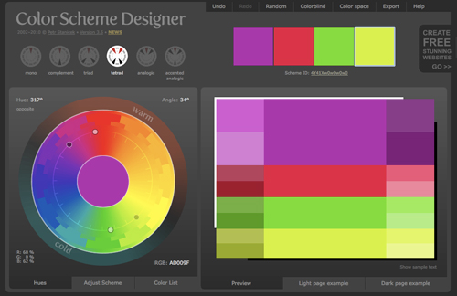
And figured out a color scheme on Color Scheme Designer. This seems kind of bogus, but it's been really helpful to me.
I transferred the text-shapes and did a very light sketch of the lady onto this kind of amazing super-thick rag watercolor paper my friend Kate gave me. This used up my last sheet and I'm sad to see it go.
The lady is watercolor and the flowers are mostly gouache. I didn't realize until recently that it was okay to mix the two! (!?)
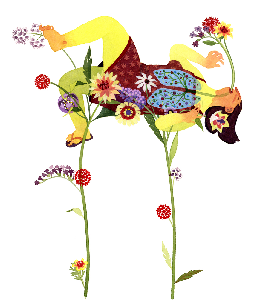
Also, the poems were all really good. I was proud to illustrate them.
Not only is your illustration for the poems quite beautiful (despite the subject matter!), but also this post is really useful.
ReplyDeleteI'd love to be an illustrator myself but, having never been to art college, the process always seems a bit wreathed in mystery to me. Every time I get a glimpse of a "real" illustrator's process it takes a little bit of the fear away.
-- oh, I saw it today via NYT-online and thought "uuh, I know that, but haven't seen it before, really." And now you sent it via RSS into my feed. Your drawing made my day, Eleanor!
ReplyDeleteAnd indeed, the next thought was: How did she come with this?
Thanks so much for sharing the process here,
Thorsten
amazing amazing! i absolutely love your work!
ReplyDeleteThanks everyone! It was a wonderful assignment.
ReplyDeleteit's gorgeous! i love that you looked up the allergin flowers, too. amazing!!!
ReplyDeleteEleanor... another stunning piece of art! I always thought you'd be a good fit for the New York Times. Your style has such a strong storytelling/ visual metaphor type of feeling to it. I'm sure they will call you back to do more editorial work.
ReplyDeleteThis comment has been removed by the author.
ReplyDeleteyour work is fantastic! great process on this one.
ReplyDeletehttp://youtu.be/Zp1TAbOFQCQ = you're a badass.
ReplyDeletedang it. I had a whole explanation.
that's barely watchable by me anyway
ReplyDeleteThis is beautiful! I recently posted an illustration about allergies on my blog that I did just for fun. It's interesting to see the way different people interpret the same subject matter!
ReplyDeleteThank you for sharing your process, too. I always find it very helpful to see how other people work.
Thanks Elisabeth! I loved your allergies illustration too, very fun to see different pieces with the same subject.
DeleteOh this ought to be submitted everywhere to win paint and words and education contests. thank you for letting me see this and for the story and drawings behind its creation.
ReplyDeleteYours, Patty J Campbell Botanist Amazing Earth Landscapes Vashon WA
Thanks so much, Patty! I always get nervous that botanists and other people who actually know about plants will be upset at my inaccuracies so I am especially glad you like this piece!
Delete